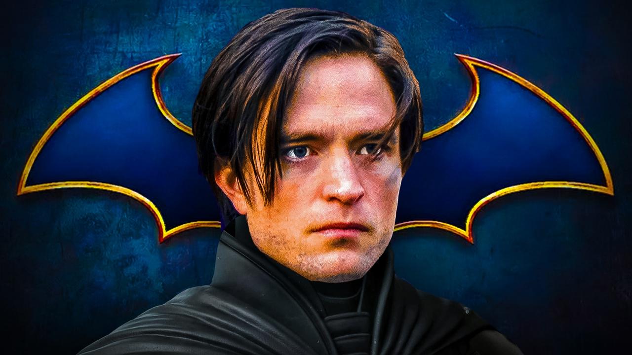
As a huge Batman fan, I was really excited to see DC just dropped a brand new logo for the character! It looks like The Batman Part II is actually happening after a lot of delays, and thankfully Robert Pattinson is coming back as the Dark Knight. They’re planning to start filming next year, and the movie is currently scheduled to hit theaters on October 1, 2027. I can’t wait!
Following the release of James Gunn’s Superman movie and news about The Batman Part II, DC Comics has updated the branding for some of its most famous heroes, starting with Batman. They recently unveiled a new logo for the character that’s a fresh look, distinct from the one used in the Robert Pattinson Batman films and other recent versions.
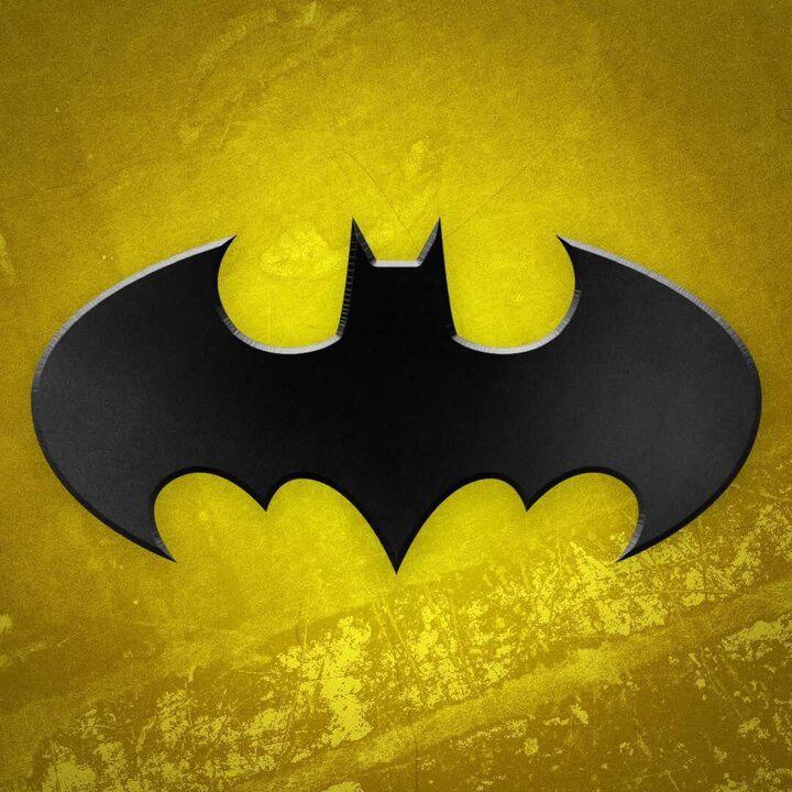
A fan noticed the new Batman logo has a softer, more rounded shape, similar to the logos used in the classic Batman movies from the late 80s and 90s – like those in Batman, Batman Returns, Batman Forever, and Batman & Robin. DC recently revealed the new symbol, and it closely resembles those earlier designs.
Fans speculated that a change to Batman’s logo might suggest the character is nearing his first appearance in James Gunn’s new DC Universe.
Since the company has already updated the logos for other characters like Green Lantern, Harley Quinn, and Wonder Woman, it’s likely these changes are part of larger plans. We know there are significant plans for Green Lantern early in the DC Universe, and reports suggest a Wonder Woman movie is being developed quickly.
Although Batman might appear in another project before his own movie, The Brave and the Bold is still likely some time away, according to recent statements from James Gunn about how it might be released. However, this shift in plans could mean they’re making progress on the film.
The new Batman logo might suggest DC is looking back to its earlier films for inspiration. It closely resembles the logos used in the Batman movies from the 1980s and 1990s, potentially indicating a return to the style and feel of those films.
The logo’s yellow background looks like concrete, which fits with Batman’s core identity as a street-level hero dedicated to protecting Gotham. The recent film, The Batman, emphasized this gritty, grounded approach, and the logo’s design may simply reflect that same feel and the character’s commitment to street-level heroism.
The latest Batman logo is a significant departure from designs used in recent films and other media. It appears to be a return to a classic look, as previous versions had moved away from the original bat-shaped symbol, and sometimes didn’t resemble a bat at all.
Recent Versions of the Batman Logo
The Batman
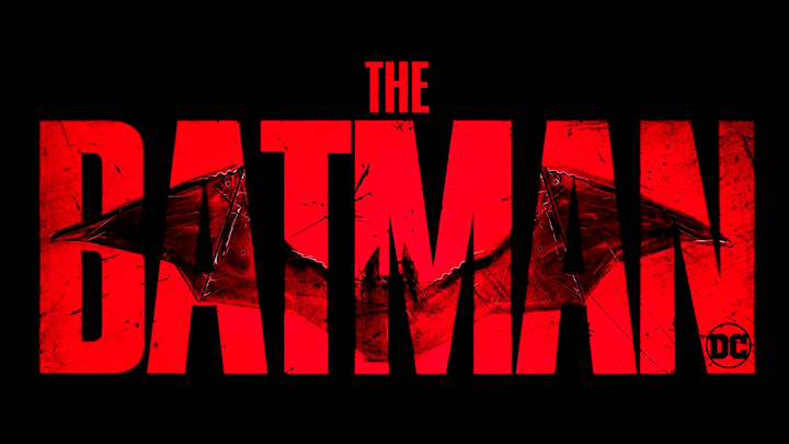
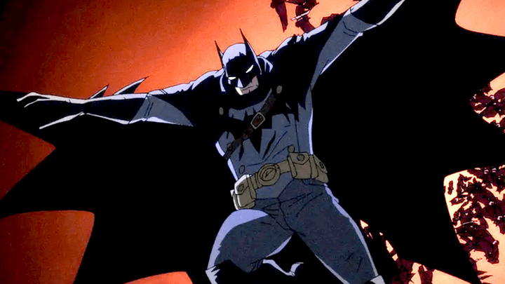
The logo for Matt Reeves’ The Batman stood out from previous Batman logos. Its wings were longer and more slender, giving it a more realistic bat-like appearance than other designs.
Even though DC recently unveiled a new logo for Batman, the older logo is likely to reappear in The Batman Part II.
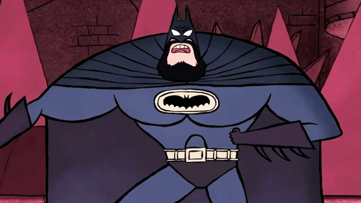
Batman: Caped Crusader
The 2024 animated series, Caped Crusader, introduced a fresh take on the classic Batman logo. Notably, it’s wider and more horizontal than previous designs, with flatter wings that aren’t as curved.
As a big fan, I always noticed the Bat-symbol on the TV series seemed surprisingly small. Considering how large and imposing Batman was supposed to be, the logo itself barely covered any space on his chest – it just didn’t feel quite right!
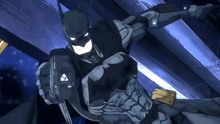
Batman: The Doom That Came to Gotham
The Batman logo in Caped Crusader was relatively small, but The Doom That Came to Gotham featured a much larger version. This logo was oversized, extending across almost the entire front of Batman’s costume, covering his chest and even reaching onto his upper stomach.
A key difference in this logo compared to others is the more pronounced shape of the bat’s body. Specifically, the bottom of the bat extends much further down than it does in many other versions – a contrast to the recent logo DC released, where that part of the design is barely noticeable.
Merry Little Batman
Unlike other Batman stories, whether animated or live-action, Merry Little Batman used a noticeably unique animation style.
As expected, the logo for Merry Little Batman looked quite different from previous versions.
While the wings in the Merry Little Batman logo have a similar curve to the newest Batman symbol, unlike Robert Pattinson’s, it has nine points extending from the bottom of each wing – significantly more than most other versions of the logo.
Batman Ninja vs. Yakuza League
I’ve been noticing something interesting in recent Batman releases! The logo in Batman Ninja vs. Yakuza League – it’s huge! Seriously, it’s much bigger than the Batman symbol we usually see. It reminds me of The Doom That Came to Gotham, where they also went with a really oversized logo. It’s definitely a design choice they’re leaning into!
The logo is generally more angular and block-like than rounded. Rather than having curved edges, most of its elements end in sharp points.
Suicide Squad: Kill the Justice League
The Batman logo in the Suicide Squad: Kill the Justice League game closely resembles the one from The Batman movie. Both versions feature extended wings and are designed to look like an actual bat.
The logo for Suicide Squad: Kill the Justice League shares a resemblance to the new logo, specifically in the curved shape of the wings at the ends.
Read more about how Suicide Squad: Kill the Justice League ended here.
Absolute Batman
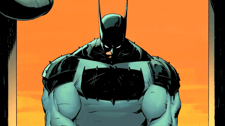
The comic series Absolute Batman offers a fresh take on the classic hero, and it stands out with a very unusual Batman symbol. Unlike the traditional logo, the one used in this series doesn’t resemble a bat at all.
The logo is essentially a rectangle with added details like wings, ears, and a tail.
This Batman logo is strikingly different from previous designs, and it looks nothing like the recently released version from DC.
2025-11-01 04:36