![]()
The logo for the new animated series *Marvel Zombies* is unique because it closely resembles the style and colors of the original comic book – a first for the Marvel Cinematic Universe. While it might seem like a small detail, it’s a cool nod to the source material that fans will appreciate.
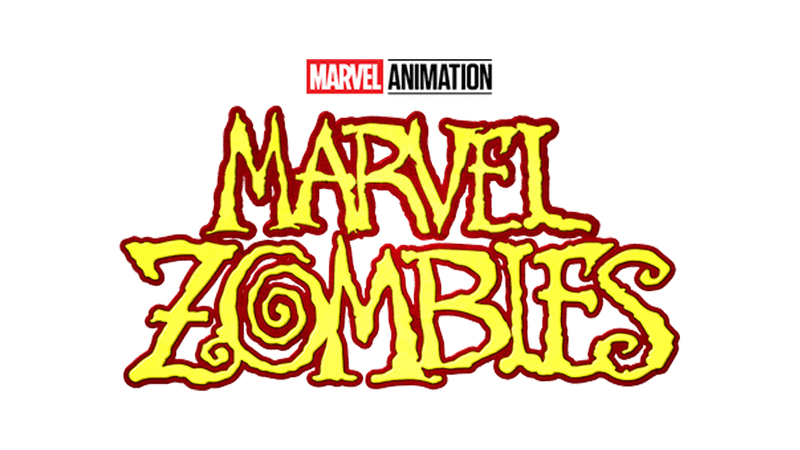
The logo for the Marvel Animation series is yellow with a dark red border. The letters are intentionally jagged and irregular, and the letter ‘O’ in the word ‘ZOMBIES’ is designed as a spiral.
The word “ZOMBIES” in the comic book logo looks exactly the same, although it’s a paler yellow. While “MARVEL” is red in the comics-different from the show’s logo-most other Marvel logos share similar styles or colors. However, no other Marvel logo matches the original quite as closely as the Marvel Zombies logo does.
The Netflix logo for *Daredevil* is strikingly similar to the one from the original comics, using the same style and colors, although the exact shades can differ. Despite being part of the same overall story as the Marvel Cinematic Universe (MCU), the first three seasons of *Daredevil* weren’t officially released *as* MCU projects.
Disney+ will release all four episodes of the animated series inspired by the *What If…?* Season 1 story on September 24th. The show features familiar actors from the Marvel Cinematic Universe voicing their characters as zombies.
Other MCU Logos Get Close To Matching Comic Counterparts
I’ve been a long-time fan of Marvel, and it’s really exciting to see the new *Marvel Zombies* series! What stands out to me is its logo – it’s the first MCU project to *really* capture the look and feel of the comic books. There have been others that hinted at it, matching either the style or the colors, but this one feels like a perfect match, and it’s awesome to see!
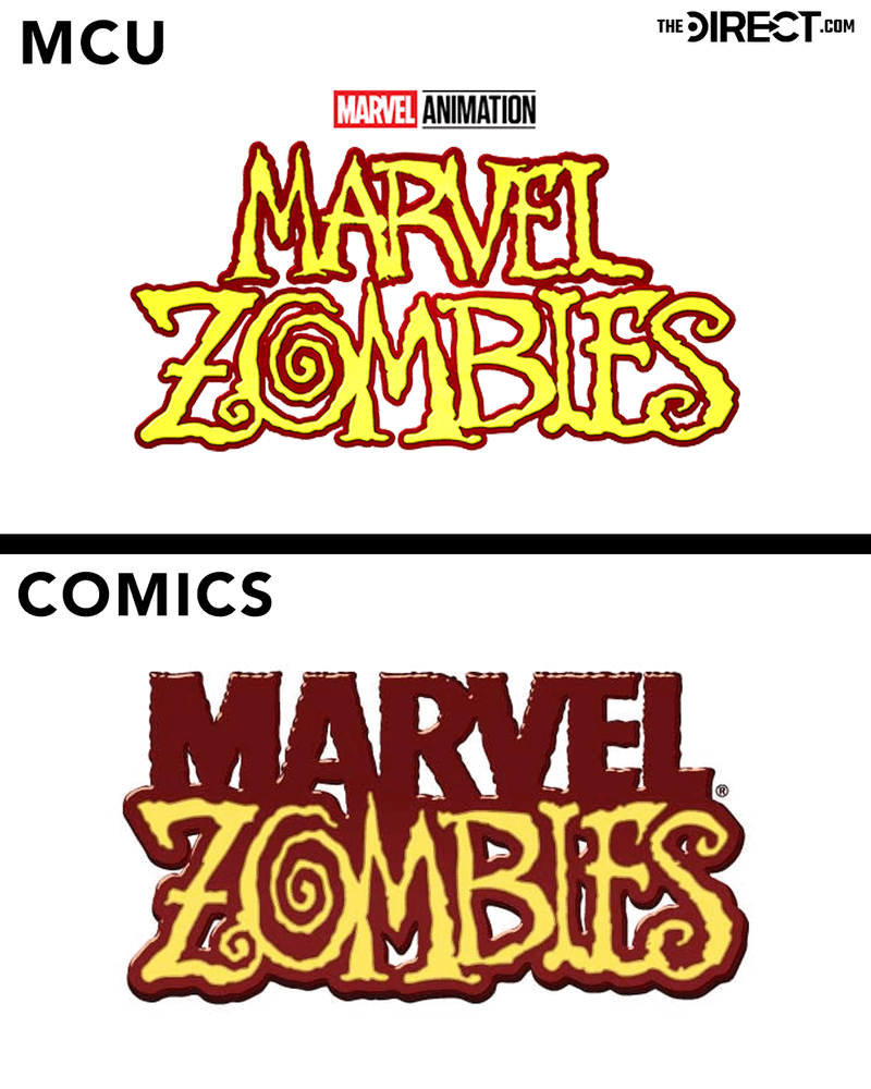
Black Panther
The logo for *Black Panther* closely resembles a logo used on the original *Black Panther* comics, with only a little more space between the letters. The movie logo isn’t black and white like the comic version, though – it’s blue with a textured look and a gold outline.
John Roshell created the comic book logo that appeared on 49 issues. Eighteen years later, it reappeared in the Marvel Cinematic Universe, which Roshell was very excited about.
I loved how the final version looked, and I’m incredibly honored that my Black Panther logo – out of all the designs used in the comics – was selected for such a fantastic and innovative film. It’s amazing to think it will always be connected to the movie.
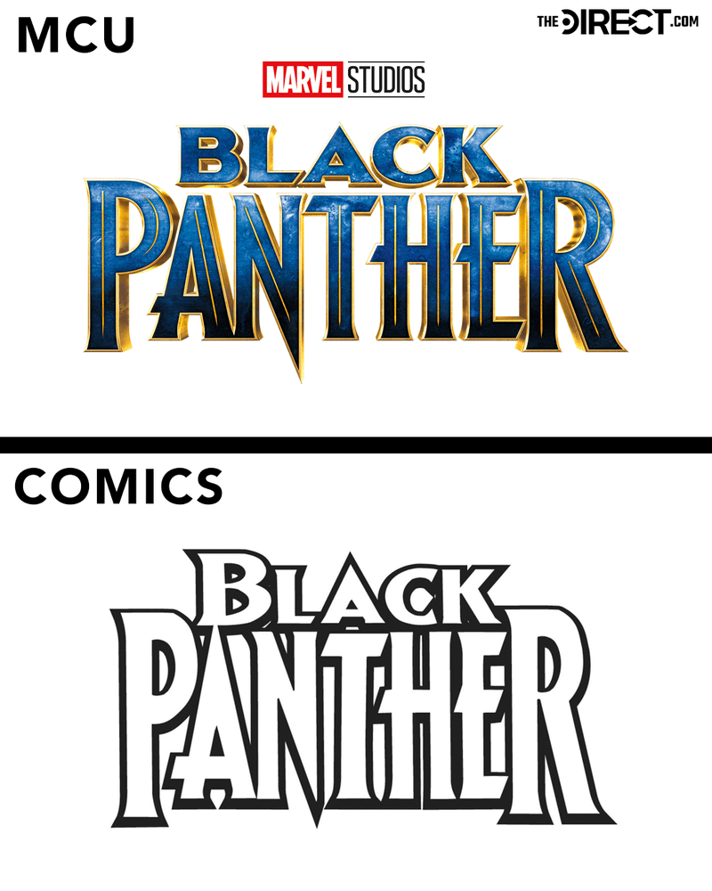
Hawkeye
The *Hawkeye* TV series mirrored the comic books in its visual style, using a very similar font-though the “y” was slightly more rounded-and the same arrow design within the “h” and target within the “a”.
The main differences between the two versions are the yellow lettering, which is a change from the black used in the original comics, and the circles surrounding the letter ‘a’, along with a bullseye in the center of it.
The Avengers
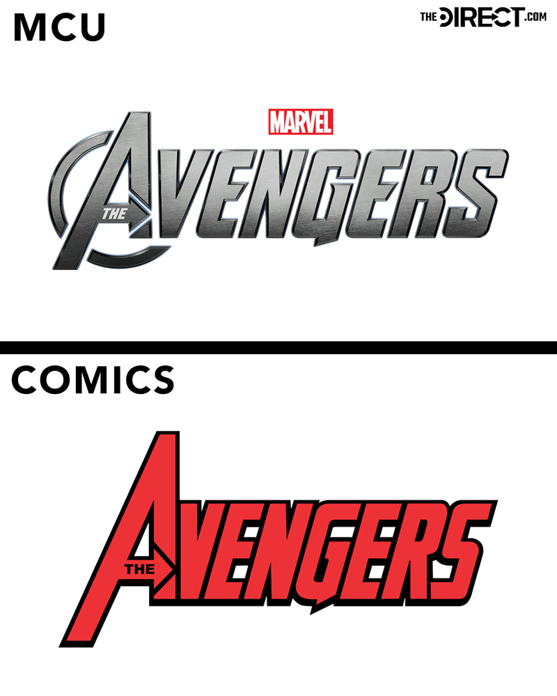
Besides the different colors – silver in the Marvel Cinematic Universe and red in the comics – the Avengers logo has one other key difference: a small, rounded shape at the bottom right of the letter ‘A’ in the movie version.
Looking closely, you’ll notice the Avengers logo in the Marvel Cinematic Universe has gaps between the letters, which isn’t the case in the comic books. However, these differences are pretty small.
Ant-Man
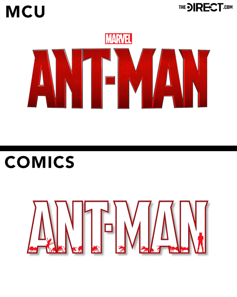
While the Ant-Man logos in the Marvel Cinematic Universe and the comics share the same red color and general hue, they have some different design elements.
The Marvel Cinematic Universe logo is solid red and appears rounded and 3D. In contrast, the logo for this comic book is just a red outline, featuring tiny red ants and Ant-Man shapes within it.
Ms. Marvel
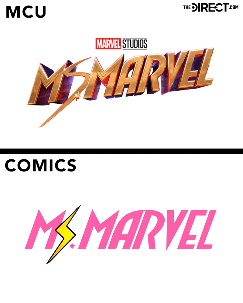
Okay, so looking at the Ms. Marvel logo, it’s definitely the one that got the biggest makeover compared to the others. But you can *totally* see where they got the idea – it’s clearly inspired by the “No Normal” comic book logo, with that same lightning bolt ‘S’ and bold lettering. What’s cool is how they tweaked the lightning bolt itself – it matches the design of Ms. Marvel’s suit in the MCU, while still nodding to the classic comic book version. It’s a nice touch!
The MCU suit and the comic book suit definitely look different. The MCU version is mostly gold with red and blue shading, while the comic version is entirely pink except for a yellow lightning bolt shaped like an ‘S’, and it’s drawn in two dimensions.
2025-09-15 07:05